How to Design a Logo for Your Business: A Practical Testing Guide
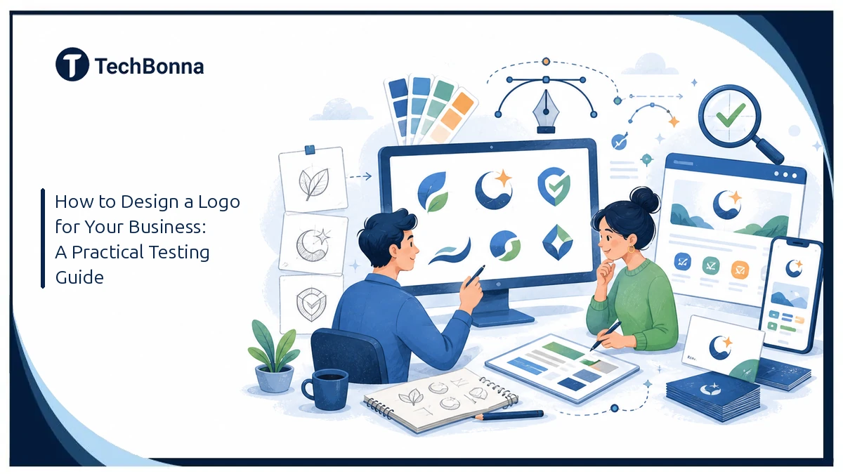
Table of Contents
Learning how to design a logo starts with more than choosing an attractive icon. A clear brand identity design process turns a rough business idea into a mark that people can recognize and use.
This guide shows you how to define the brief, develop concepts, run practical tests, choose the right logo file formats, and check trademark risk before launch.
Quick Answer: How to Design a Logo
To learn how to design a logo, define the brand and audience, brainstorm distinct ideas, choose a suitable logo type, create several concepts, and test the strongest option at different sizes and in one color. You can use a designer, design software, or an AI tool, but the final mark should be readable, distinctive, legally screened, and available as editable vector and transparent image files.
How an AI Logo Generator Works
Most tools begin with a short brief. You enter a business name and may select an industry, visual style, color palette, icon, or tagline. The system combines those choices with templates, design rules, or generative AI to present multiple logo ideas.
A template-led logo maker rearranges existing fonts, layouts, and stock symbols. A generative system may create a new icon from a text prompt. Some platforms blend both methods: AI creates or recommends the core concept, while a structured editor keeps the typography and layout usable.
The editor matters as much as the first set of AI logos. A striking first concept has limited value if you cannot fix spacing, simplify an icon, change individual colors, or export an SVG file.
Build a Clear Brand Brief Before You Generate
A strong logo starts with an understanding of your brand, target audience, and competitive position. When learning how to design a logo, this brief keeps every later choice tied to a business purpose. Starting with random style choices produces random results. Write a one-paragraph brief before opening a logo generator. State what the business does, who it serves, what feeling the brand should create, and where the mark will appear.
A useful brief answers these questions:
- What exact business name and tagline must appear?
- Who is the main customer?
- Should the brand feel established, playful, technical, premium, local, or another clear trait?
- Which symbols fit the offer, and which clichés should be avoided?
- Will the logo be used on an app icon, storefront, website header, business card, packaging, or clothing?
- Which competing brands must it not resemble?
Keep the prompt specific without prescribing every detail. “A dependable bookkeeping service for independent construction firms, with a clean geometric mark and no calculator icon” gives an AI logo maker more direction than “make a modern finance logo.”
Choose a Logo Type and Develop Concepts
Use the brief to brainstorm several visual directions before polishing one. If you are deciding how to design a logo that must work in many places, compare a wordmark built from the company name, a lettermark, a symbol, a combination mark, and an emblem. Each type creates different constraints for small screens, long names, and physical production.
Start in black and white. This keeps attention on shape, spacing, and typography before color hides structural weaknesses. Sketch loose ideas first, then develop the strongest concepts in design software or with an online tool.
A useful logo design process separates exploration from selection. Generate enough variety to compare meaningful directions, but do not spend hours adjusting a weak concept that never matched the brief. Apply basic design principles such as balance, contrast, proportion, alignment, and clear negative space. The best logo is not the busiest one. A simple logo is easier to recognize and adapt.
Compare Logo Concepts With a Repeatable Test

First impressions can hide practical defects. A repeatable test is central to how to design a logo that survives real use. Apply the same review process to every option, whether it came from AI, a template, or a professional designer.
The public workflows and stated export features of LOGO.com, Canva, Adobe Express, VistaPrint, and Namecheap all emphasize fast concept generation and editing. Their public pages differ in what they promise about vector downloads, brand kits, and continued customization.
That comparison suggests a better buying rule: judge the deliverables and editor, not the number of concepts shown. A grid of 100 similar options is less useful than five distinct directions you can edit, screen for legal conflicts, and apply across real assets.
Check Typography and Logo Colors
Choose a typeface that matches the brand and remains readable at small sizes. A serif font can suggest heritage or editorial authority, while a clean sans serif can feel direct and modern. Avoid stretching letters or combining several decorative fonts.
Build a compact color palette and document each value. Logo colors should work on light and dark backgrounds, but the shape must still communicate when color is unavailable.
Run a Small-Size Legibility Test
Reduce each concept to about 32 pixels high. This approximates a browser favicon, profile avatar, or compact mobile header. Remove any option whose symbol collapses, whose letters merge, or whose tagline becomes visual noise.
Repeat the check in grayscale. A design that depends on two colors with similar brightness may lose its hierarchy when printed in black and white.
Check Contrast and Color Independence
Text that is part of a logo has no minimum contrast requirement under WCAG 2.2. However, website copy and interface controls that use the brand palette still need accessible contrast. The W3C guidance requires at least 4.5:1 for normal text and 3:1 for large text.
Test website copy, buttons, and navigation with the proposed palette. Do not assume a color combination works across the brand because it looks good inside a large logo preview.
Try One-Color and Reversed Versions
A strong custom logo should work in solid black, solid white, and full color. Test it on both light and dark backgrounds. Thin lines, gradients, shadows, and tiny cutouts can disappear on embroidery, stamps, vehicle graphics, and low-cost print jobs.
AI Logo Maker vs. Designer: Choose for the Risk
An online logo maker is useful when speed, exploration, and budget matter most. It can support an early-stage business, event, side project, internal tool, or proof of concept. You can create a logo in one session and see it on mockups before committing.
A professional designer becomes more valuable when the identity must stand apart in a crowded market, support several product lines, pass stakeholder review, or carry meaningful legal and commercial risk. A designer can research competitors, explain the strategy, create original forms, and define a complete visual system.
AI is strongest for exploration; human judgment is strongest for differentiation and accountability.
| Decision Factor | AI Logo Tool | Professional Designer |
|---|---|---|
| Speed | Concepts in minutes | Usually days or weeks |
| Early Cost | Often free to try | Upfront project fee |
| Customization | Limited by the editor | Built around the brief |
| Distinctiveness | Requires careful checking | Can include original research and drawing |
| Strategy | Usually self-directed | Guided discovery and rationale |
| Legal Assurance | Terms vary by platform | Contract and rights can be negotiated |
A hybrid process works well for many small firms. Use AI logo tools to identify promising colors, symbols, and layouts. Then ask a designer to refine the chosen direction, remove generic elements, and prepare a controlled set of production files.
Verify Ownership and Trademark Risk
Downloading a file does not prove that a mark is unique or safe to register. Read the platform’s current commercial-use and ownership terms before paying. Save a copy of those terms with the project record because policies can change.
The U.S. Copyright Office published Part 2 of its Copyright and Artificial Intelligence report on January 29, 2025. The report explains how human authorship affects the copyrightability of work created with generative AI.
Copyright is not the only issue. A logo can conflict with an existing trademark even if it was generated without copying a known image. Search the business name, close spellings, and similar visual marks in the USPTO trademark database. Check state records, domain names, app stores, social platforms, and normal web results too.
A database search is a screening step, not a legal clearance opinion. Ask a qualified trademark attorney for advice before investing heavily in packaging, signs, advertising, or a national launch.
Download the Right Logo File Formats
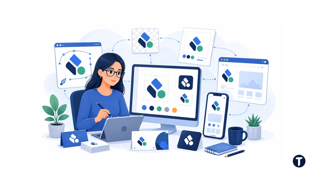
Do not leave the project with one small JPG. You need a practical package for web, print, editing, and future suppliers.
- SVG: A vector format that stays sharp at any size. Use it for websites, signs, and many print workflows.
- PDF or EPS: Common vector deliverables for printers and production partners.
- PNG: A pixel format with transparency. Use it for slides, social profiles, documents, and web graphics.
- WebP: A compact web format for fast-loading site assets, when the platform supports it.
- JPG: Useful for previews with a fixed background, but unsuitable as the only master file.
Request full-color, black, white, horizontal, stacked, symbol-only, and wordmark versions. Store the font names, color values in HEX and RGB, and basic spacing guidance alongside the logo files.
An SVG master plus transparent PNG exports covers most small-business needs. Keep the original editable source as well, even if you do not expect to change it soon.
Turn the Logo Into a Consistent Brand Identity
A logo is one component of brand identity design. Customers also encounter your typography, photography, icons, writing style, page layouts, support messages, proposals, and product experience.
Those elements need to hold together offline as well. For a practical example, see how consistent branded apparel builds recognition by carrying the same visual cues into events, deliveries, and everyday customer contact.
Create a one-page brand sheet with:
- Approved logo versions and minimum display size.
- Primary and secondary colors with exact values.
- Heading and body fonts with fallback choices.
- Rules for clear space and prohibited effects.
- Examples on a website header, social avatar, business card, and document.
- A short description of the brand voice.
Consistency matters more than constant novelty. Teams lose time when every new social post or sales deck starts from a blank page. A compact brand kit gives people safe defaults while leaving room for campaign-specific ideas.
Common AI Logo Design Mistakes
Fast generation can encourage fast approval. Slow down before the logo becomes expensive to replace.
- Choosing the first attractive option: Compare at least three distinct directions against the same brief.
- Using a literal industry cliché: Generic lightbulbs, globes, shields, roofs, and rockets make brands blend together.
- Keeping too much detail: Tiny lines and text fail at favicon, embroidery, and mobile sizes.
- Ignoring typography: The business name is often the most important part. Check kerning, case, weight, and readability.
- Skipping similarity searches: AI-generated does not mean unique.
- Accepting one layout: A wide website header and a square social avatar need different arrangements.
- Failing to test real applications: Review the mark on invoices, signs, app icons, packaging, and dark backgrounds.
Keep the final design simple enough to recognize after a quick glance. Remove any element that does not improve meaning, distinction, or balance.
How to Design a Logo Step by Step
Use this sequence to move from an open brief to production-ready artwork:
- Step one: Define the audience, offer, position, and personality.
- Step two: Study competitors and list the visual clichés to avoid.
- Step three: Brainstorm wordmark, lettermark, symbol, combination-mark, and emblem directions.
- Step four: Sketch several black-and-white ideas before choosing colors.
- Step five: Refine typography, spacing, alignment, and negative space.
- Step six: Compare the strongest concepts at 32 pixels and in one color.
- Step seven: Check similar names and visual marks before committing money.
- Step eight: Export vector, transparent, print, web, light, and dark versions.
- Step nine: Document colors, typefaces, spacing, and minimum size.
- Step ten: Test the final package on real brand applications before launch.
This is how to design a logo without confusing fast concept generation with a finished identity. Each step removes a different source of risk.
Questions to Ask Before Choosing an AI Logo Tool
Is a Free Logo Maker Truly Free?
Many platforms are free to try, while certain downloads or brand-kit features may require payment. Check the current offer before you start. Confirm whether the free logo includes a transparent background, a vector file, commercial-use rights, and editing after download.
Can You Customize an AI-Generated Logo?
A capable logo design tool should let you change fonts, spacing, colors, symbols, and layout. That flexibility matters when learning how to design a logo for several applications instead of one preview. Test the editor before choosing a concept. If the AI creates a promising mark but locks the key elements, you may have to rebuild the idea elsewhere.
Will an AI Logo Be Unique?
No generator can guarantee legal uniqueness without a proper search. That check is part of how to design a logo that a business can use with confidence. Template combinations and common prompts can produce similar results for different users. Customize your logo, document meaningful human edits, and complete name and visual-mark searches before launch.
What Should a Logo Maker Provide?
Look for clear commercial terms, an editable SVG, transparent PNG files, light and dark versions, multiple layouts, and reliable access to saved designs. These deliverables complete how to design a logo as a usable business system. Mockups and a brand kit are useful, but portable master files matter more because they keep the business from being locked into one platform.
How to Design a Logo That Is Ready to Launch
This final check confirms how to design a logo that is ready for customers, suppliers, screens, and print. Confirm each item before publishing the new identity:
- The design matches a written audience and positioning brief.
- The name and tagline are spelled correctly.
- The symbol remains clear at 32 pixels and in one color.
- The palette supports accessible website text and controls.
- Similar names and marks have been searched.
- Commercial-use terms and project records have been saved.
- SVG, transparent PNG, print, light, dark, and alternate-layout files are available.
- A one-page usage guide is ready for employees and suppliers.
Learning how to design a logo means combining a clear brief, useful brand identity design, disciplined testing, and a trademark screen before launch. Secure the right logo file formats, document the final rules, and refine the mark until it works everywhere your business appears.